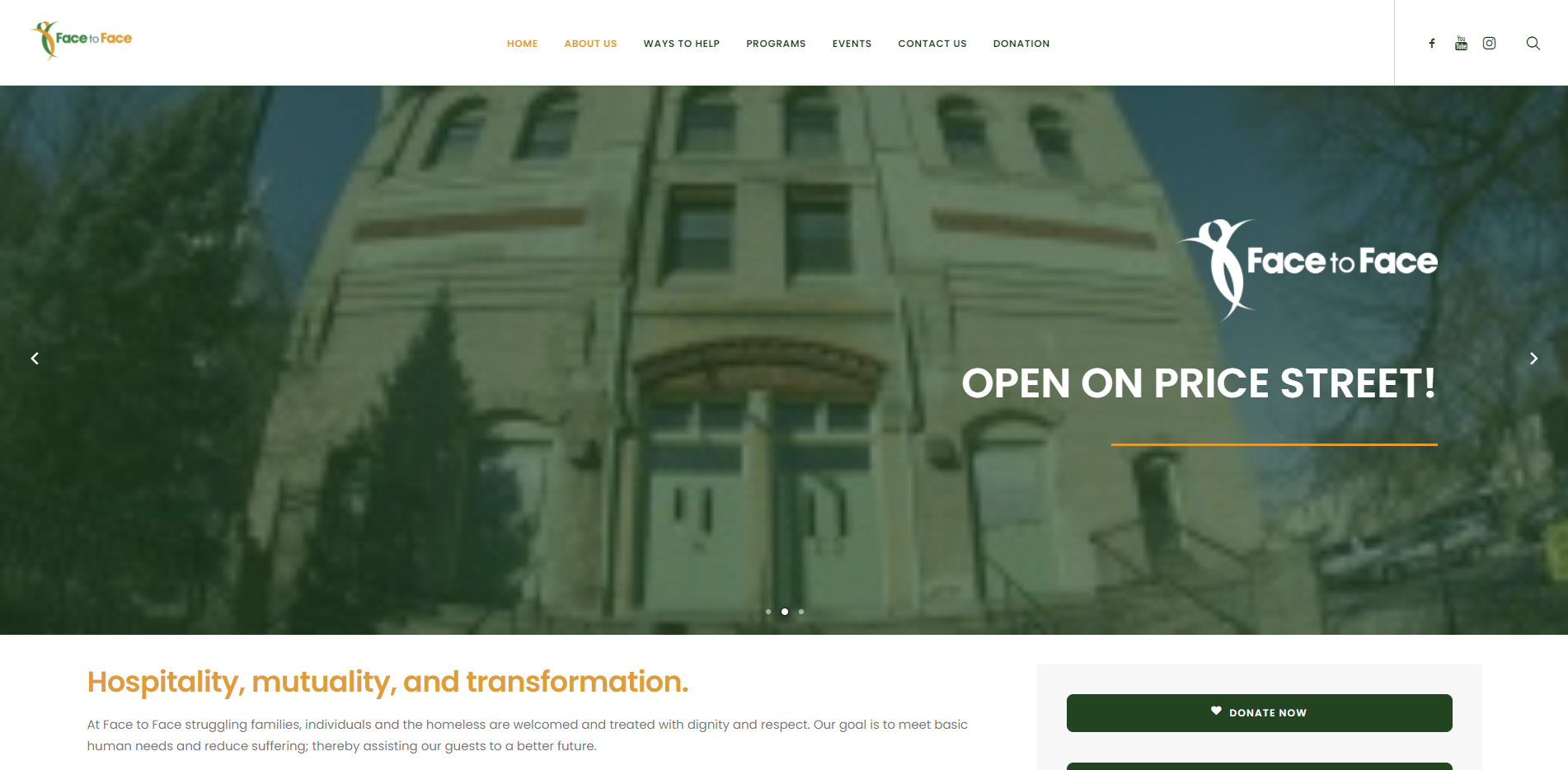
Face to Face Germantown's desktop website
Overview
Face to Face is a non-profit organization based in Germantown, PA. Their goal is to "meet basic human needs and reduce suffering; thereby assisting our guests to a better future." Users of their website include volunteers, donors, and clients — struggling families, individuals, and the homeless.
Scope
Assess the navigability of the website, and evaluate where the website can improve regarding visual design. The client wished to reduce the primary navigation options in particular.
Methods & Practices
Heuristic Analysis • Tree Study • Card Sorting (Open & Closed) • Sitemap • Wireframing
Tools
Google Sheets • Optimal Workshop • xSort • Draw.io • Figma
Timeline
3-week design sprint
The original Face to Face Primary Navigation was in need of a change
There were two forms of global primary navigation on the website: the top bar, and the right-side navigation menu.
The client was eager to reduce the amount of clutter and primary navigation options on their website.
To address how to best alter the navigation of the website, I conducted a tree study as well as open & closed card sorting.


Can users currently find the information they need?
An initial tree study was conducted through Optimal Workshop to assess whether or not the primary user groups of Face to Face's website could find the information they needed. Three tasks were assigned to each tree study participant to reflect these groups.
Volunteer Task
You are interested in learning when you can volunteer. Where would you go to find the hours that you can help?
Donor Task
You would like to donate to this particular organization. Where would you go to donate either monetary funds or resources?
Client Task
You would like to get a meal from this organization's soup kitchen. Where would you go to find soup kitchen hours?
The most difficult task was...
Based on the overview results, users struggled the most with finding the soup kitchen hours, which was under “Schedule.”
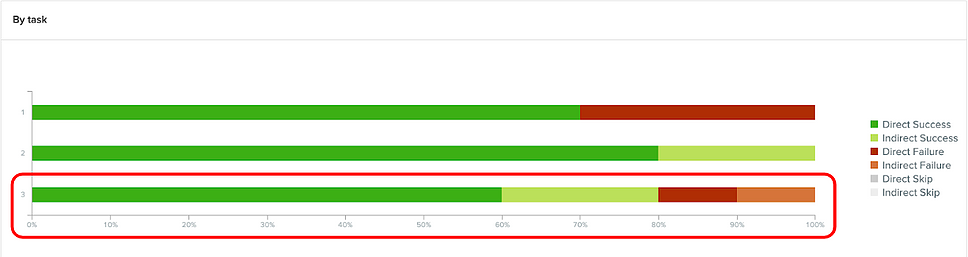
The task to "find the south kitchen hours" had the most direct and indirect failures.
Users also believed “Schedule” was involved in volunteering hours instead of soup kitchen hours.
As “Schedule” was a primary navigation menu item, it was not tested during any open or closed card sorting.
Hence, it would be wise to re-run another tree study with a changed name. For example, “Schedule” could be modified to “Kitchen Hours” to see whether users would choose this option when asked to find the soup kitchen schedule, and to make sure it is not confused with volunteering hours.
Open card sort
I utilized xSort for 5 total participants. The participants were those who had volunteered in the past and were familiar with the process.
5 dominant categories formed based on donation content, volunteering content, programs content, and content about Face to Face itself:
VOLUNTEER, DONATE, ABOUT US, PROGRAMS, and PRESS.
In producing these open sort categories, many secondary navigation titles performed successfully and were properly categorized by users.
However, certain names stuck out as problem areas.
A lot of users were confused by what certain options were, either because they were too vague (such as “Pre-School”) or too out of context (such as “Help Our Neighbors”).
Thus, some secondary navigation names were altered for the closed card sort.
What should we change?
I created new categories (primary menu labels) for the next phase of testing:
VOLUNTEER, SUPPORT US, ABOUT US, PROGRAMS, and EVENTS.
"About Us" formed by merging the primary navigation titles of “About Us,” “Media,” and “Contact Us”.
"Support Us" came to be because users were confused as to why “Donate” and “Donation” both exist as secondary navigation options.
Additionally, multiple secondary navigation names were changed.
Pre-School ➡️ On-site Pre-school
5/5 users had no idea where to put “Pre-school.”
Wish List ➡️ What To Donate
4/5 users didn’t know what “Wish List” meant or stood for.
Help Our Neighbors ➡️Other Local Organizations
4/5 users did not know this was a link to a page with more organizations.
Our Dining Room ➡️ Food Kitchen
3/5 users did not know if was actually a service for clients.
Donate ➡️ Donate Now
To adjust for the fact that “Donate” takes you to a new page, I added “Now” for greater immediacy.
Closed card sort
I utilized Optimal Workshop for 10 total participants.
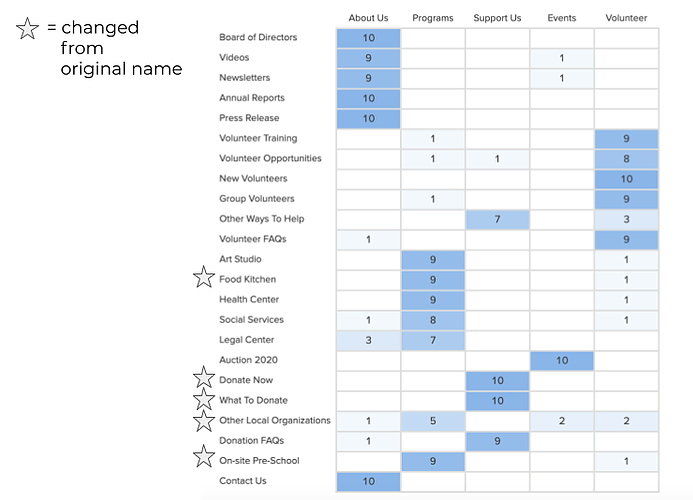
A table showing how many participants chose to sort each secondary label into each primary category.
The following names performed very successfully with dominant, correct consensus:
Food Kitchen, changed from “Our Dining Room”
Donate Now, changed from “Donate”
What To Donate, changed from “Wish List”
On-site Pre-school, changed from “Pre-School”
The name that still led to some confusion was "Other Local Organizations", which used to be “Help Our Neighbors.” Users still consistently felt that this was a program.
What we learned, and what to do next
As aforementioned, “Other Local Organizations” most dominantly fell into a program, as did “Help Our Neighbors”.
“Other Ways To Help” was consistently sorted into the donations-related category, or something other than volunteering.
“On-site Pre-school” was consistently sorted as a program. While it is unclear from the Face to Face website what the partnered pre-school really is, it is important to know that users feel that the pre-school is a program that Face to Face is involved with.
Additionally, on a visual and navigational basis, I believe it would be prudent to eliminate the right-hand side global navigation completely.
Visual design facelift, part one: heuristic analysis
A total of 16 pages were analyzed using the Abby Method.
I took the worst-performing pages across the board (usability, clarity, delight, and more factors included) and gave them a visual update in Figma.
Visual design facelift, part two: sample visual design recommendations
"Volunteer Info" page: current vs. proposed redesign
Current design
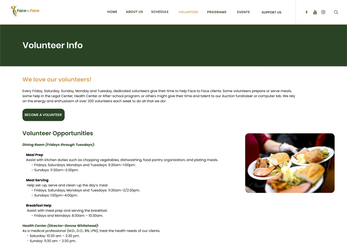
Proposed design
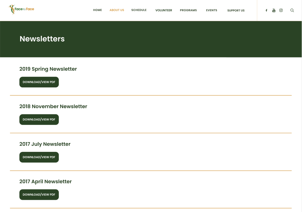
"Newsletter" page: current vs. proposed redesign
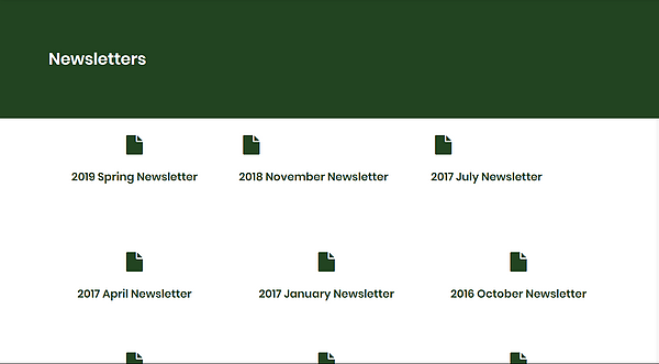
Current design
Proposed design
Next steps & final thoughts
In the future, Face to face Germantown can take these recommended next steps to further improve the website's usability and navigation.
Continue to tinker with the names which performed the worst, such as “Help Our Neighbors”/”Other Local Organizations.”
Re-run tree study tests with modified titles to validate new labels for primary and secondary navigation menu items.
Reassess the design system currently in place for Face to Face, and give visual updates to other pages within the website.