Note: at our client's request, we are withholding the title of the product within the body text of this case study.
Overview
Real estate transactions in the state of New York can be deeply complicated and burdened by miscommunication. Large quantities of documents and conversations can exist between multiple parties, and email transactions can lead to the increasingly common problem of wire fraud. To combat these frustrations, our client's app provides a secure and streamlined space for communication and document-sharing.
Design Team
Katie Luo • Marilyn Shi • Jessica Chin • Valeria Lebedeva
I played the roles of UX Researcher, UX Designer, and UI Designer.
Scope
Create a minimum viable product (MVP) interactive prototype for how the app would appear to real estate agents. Operate under the definition of a “real estate transaction” being the very beginning of the process—looking at properties to buy—to the end, receiving the keys for a new property.
Methods & Practices
Research
User Interviews • Affinity Mapping • Persona Creation • Journey Mapping • Competitive Landscape Matrix • MoSCoW Map • Feature Analysis • Feature Prioritization Matrix
Design
Design Studios • Wireframing • Rapid Prototyping • Iterative Testing • Usability Test Reports • Sitemap • User Flows • 5-Second Tests • Specifications Documentation
Tools
Miro • Figma
Timeline
3-week design sprint
Research & synthesis: who are the real estate agents?
We interviewed 6 real estate agents who had practiced in the New York City metropolitan area and got to know their key priorities.
"Your role as an agent is to be a mentor to your client… make sure you are an expert as to how the transaction works, so you can act in their best interest.”
“You must double-check every step of the transaction...don’t risk getting your client in trouble.”
“There is a lot of information to process from a lot of different people. It’s hard to keep track.”
What do real estate agents struggle with?
Real estate agents only come in at the very beginning and end of the transaction process. Real estate attorneys handle much of what comes in between.
Thus, it was not uncommon for real estate agents to feel left in the dark during the process.
And yet, real estate agents needed to be accountable for all important documents, relevant contact information, and need to double-check very transaction step.
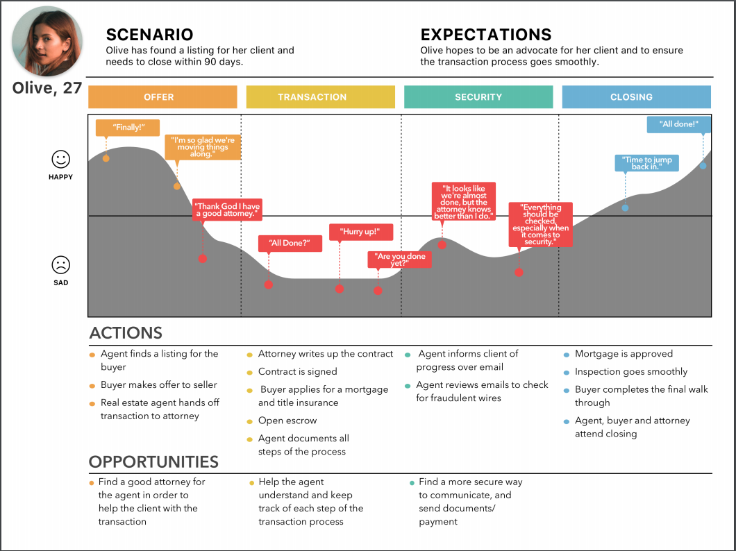
Meet our primary persona, Olive
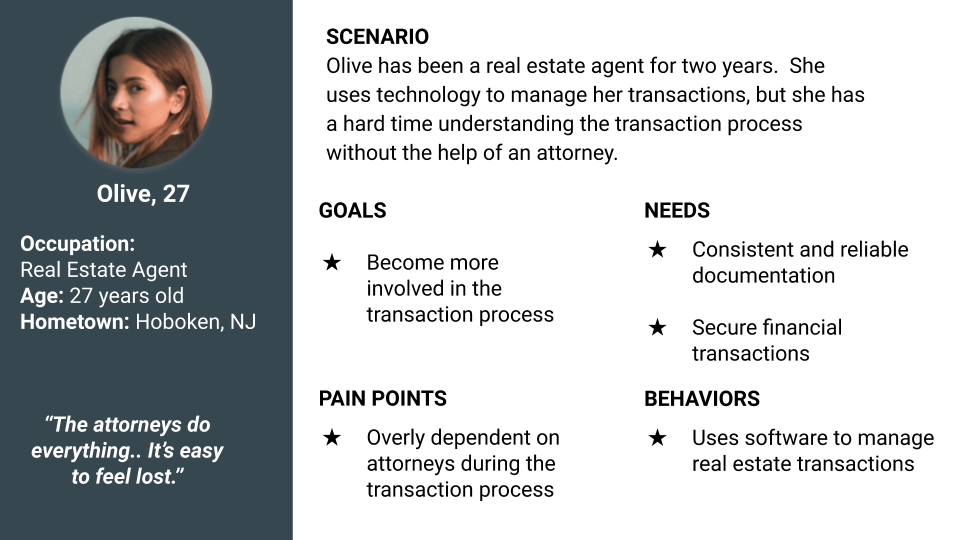
How might we identify key opportunities for Olive? We journey mapped, of course, and we emphasized finding a more secure way to communicate and send documents.
Our problem statement
When real estate agents start the transaction process, they don’t always understand how to complete it.
Olive is a real estate agent who does not know how to see her process through.
How might we help Olive understand and partake in the entire transaction process?
Prioritizing features to design
Our team utilized the MoSCoW Method to prioritize features before we ran two design studios.

Once we had finished our paper prototypes, we recruited participants with experience in residential real estate to run low-fidelity usability tests.
During these tests, we focused on finding out what information our primary user would want to see in a dashboard and property listing.
These desired improvements made into our mid-fidelity prototype, which would be tested next.
Iterative testing, mid-fi to high-fi
We ran usability tests on our mid-fi prototypes, and changes to the high-fidelity prototypes are shown below.
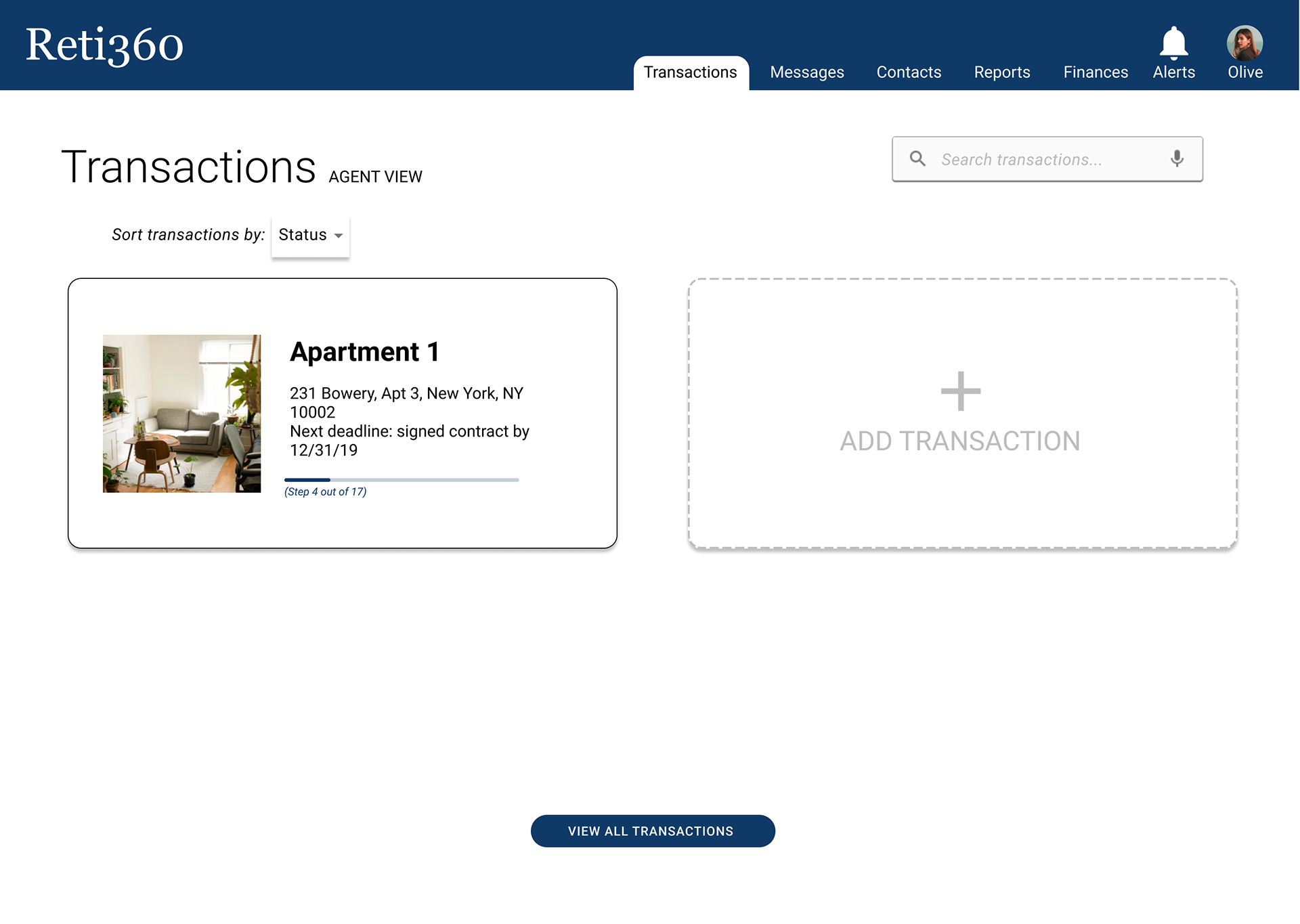
Designing a useful landing page:
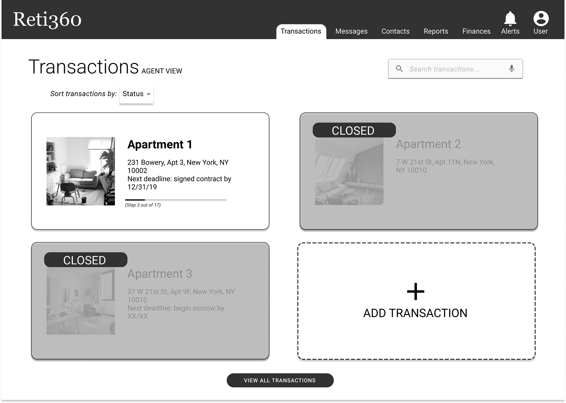
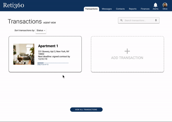
Transactions homepage, mid-fidelity
Users believed it to be unnecessary to show closed transactions on the home page, and they wanted more information about the property on the transaction cards.

Transactions homepage, high-fidelity
Thus, in our next design, we updated the home page to only show active listings. We added more information about the property within the listing page itself.
Creating a valuable deadline tracker:
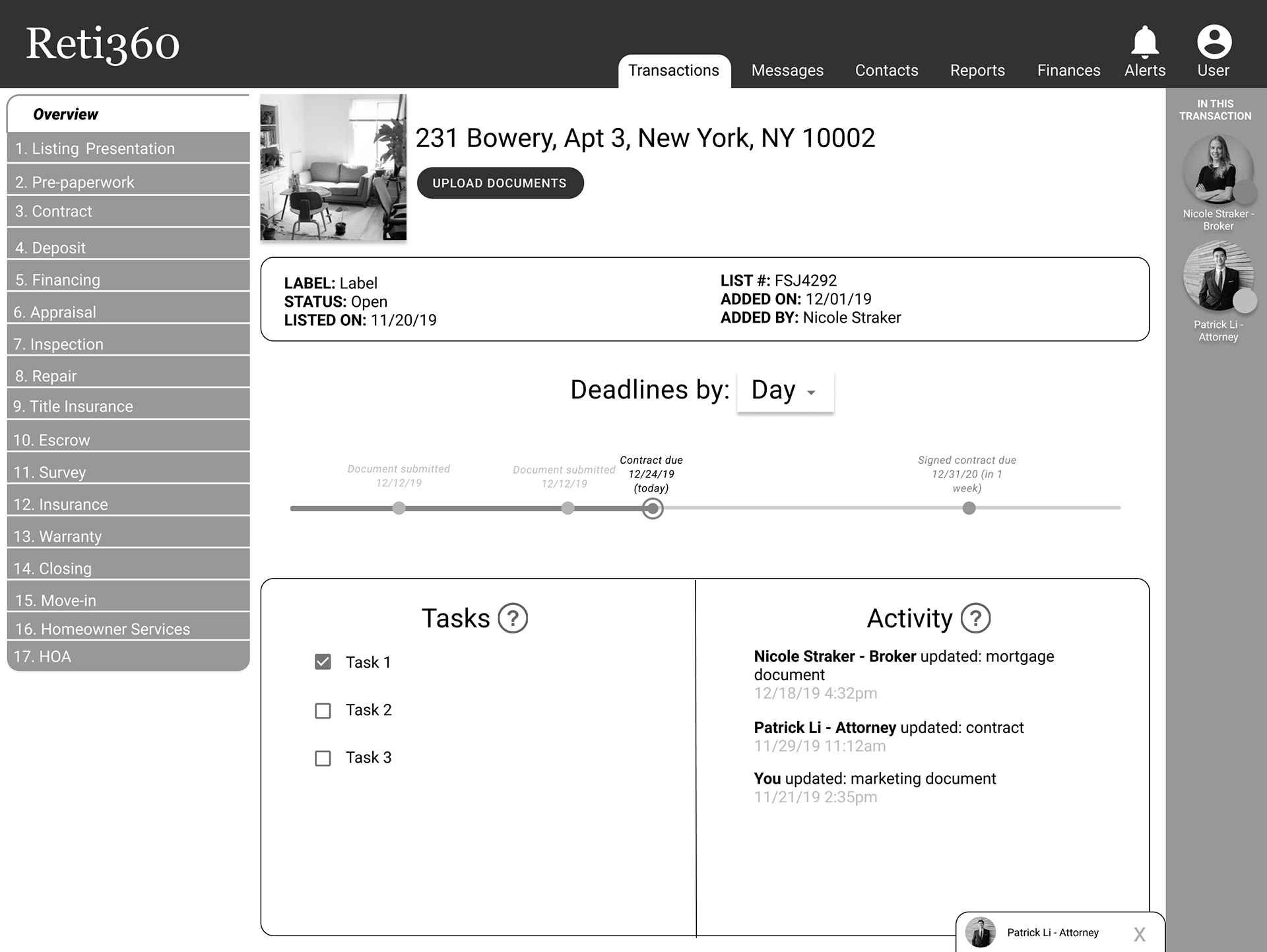
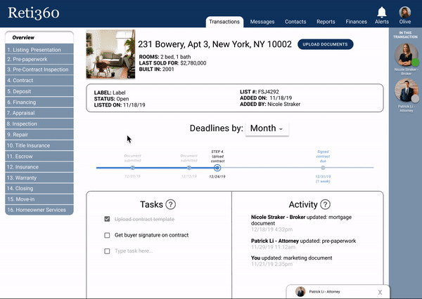
Transactions listing page, mid-fidelity
Users were delighted by the deadline timeline feature, but they wanted to see dates and tasks more clearly. Additionally, users wanted more information about the property.
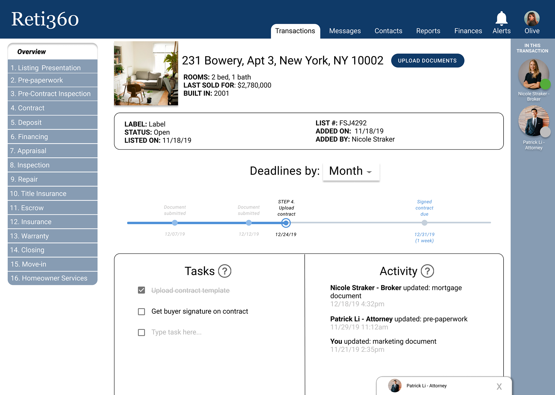
Transactions listing page, high-fidelity
Therefore, our next design included more details about the property in the listing, and we clarified the timeline content.
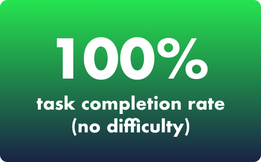
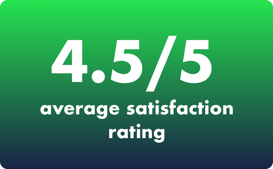
How did users like our high-fidelity prototype?
Our team ran a total of 10 usability tests.
“This is super useful… You have no idea. I usually carry a little folder with each client’s information.”
“In the field, I need to mentally recall where we are in each transaction. So, this is great.”
“I like that I can see who I’m involved with. It’s much easier than keeping a spreadsheet for my contacts and transactions.”
Prototype demos
View a transaction
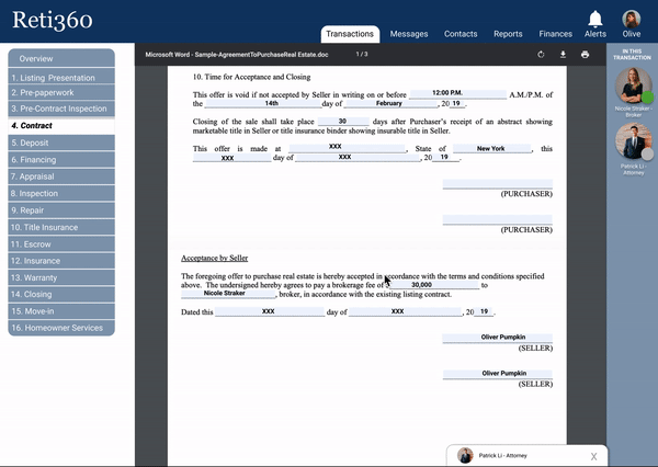
See live document updates
Send & receive messages
All wireframing and prototyping was completed in Figma. I led the creation of the design system (components library, branding, and organization of assets).
Final thoughts
Collaborating with the CEO of the web app and the lead developer allowed us to move forward as a team with both the users and the client's business goals in mind.
While our client approached us with a prepared solution, they were open to taking a user-centric approach, and our results show the benefit of a user-first mindset.
In the future, this app could undergo more researching and designing:
Continue to iterate on our high-fidelity wireframes;
Design and flesh out the rest of the web app’s functionalities and pages within the real estate agent’s view;
Conduct user research on buyers and sellers as well as service providers;
And design wireframes and user flows for the aforementioned parties.