Overview
As the gaming industry grows in players and profits, it becomes increasingly important to consider the effects of online gaming relationships upon players. Online gaming communities can be extremely toxic; as such, it can be incredibly difficult to experience a positive connection with random players online. G-Harmony aims to solve this difficulty.
Design Team
Katie Luo • Richard Lam • David Duhl-Coughlin
I played the roles of UX Researcher, UX Designer, and UI Designer.
Scope
Identify a problem within the online gaming space and design a minimum viable product (MVP) to resolve a significant pain point.
Methods & Practices
Research
User Interviews • Affinity Mapping • Persona Creation • Journey Mapping • Competitive Landscape Analysis • MoSCoW Map • Feature Analysis • Feature Prioritization Matrix • Contextual Inquiry
Design
Design Studios • Wireframing • Rapid Prototyping • Iterative Testing • Usability Test Reports • User Flows • iOS Human Interface Guidelines • Specifications Documentation
Tools
Figma
Timeline
2-week design sprint
Research & synthesis: what problem are we best fit to solve?
Out of 27 screened participants, our team conducted 8 interviews. We varied our users between those who lurked online, engaged frequently with friends, and people who engaged with strangers.
Who do gamers socialize with when playing online?
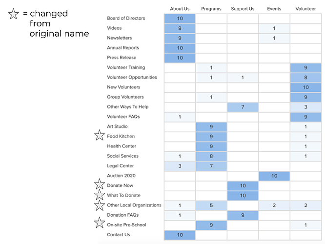
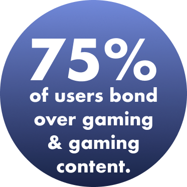
Through affinity mapping, our team discovered there was a large gap between the value of gaming with friends and the value of gaming with strangers.
Meet our primary persona, Derek
The problem to be solved
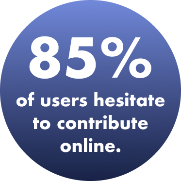
Online gamers have specific standards and criteria for who they want to play with.
Derek has been gaming for five years, and he still struggles to find people who match his play style, are at his skill level, and share a similar sense of humor with him.
How might we help Derek find other players he can have a good experience with and potentially form a lasting connection with?
What can we design that will most help Derek?
Before ideation, our team deemed certain features necessary for our MVP: channels for communication, opportunities for player personalization, and a gamer matching algorithm.
These features would help Derek connect with like-minded individuals quickly and accurately.
After our design studio, we pushed out a paper prototype to validate our design and gather feedback.
Thus began our iterative testing phase.
We made sure all of our testers were online gamers. Some key modifications from usability test results are shown below.
Low-fidelity to high-fidelity: speaking the language of our users
Questionnaire screen, low-fidelity
Questionnaire screen, mid-fidelity
In our initial drafts, users did not understand what the survey was for.
We needed to re-organize our user flow and cater questions to specific games, as we found that general play style questions would not necessarily be accurate for every player's specific needs per each video game title.
As such, we knew we had to make sure questionnaires were catered to individual titles. Our high-fidelity questionnaire screen focused on League of Legends playstyles, specifically.
Questionnaire screen, high-fidelity
In our current version of G-Harmony, users can now answer questions specific to the game they selected prior to arriving at the questionnaire.
The brevity of the questionnaire means users can get into games quickly, a priority discovered from testing, while still allowing for accurate matching.
Mid-fidelity to high-fidelity: making useful profile pages
Player profile screen, mid-fidelity
We discovered our profile page didn't feel personalized enough. For example, there was no biography or section to learn more about the player beyond what games they played or what endorsements they received.
Additionally, the most important information was not shown first.
Player profile screen, high-fidelity
We added an area for users to input their own description for personalization.
We rearranged content so that what was most important on the page came first: the player avatar, endorsements (which 50% of testers explicitly wanted to look at first), and the ability to contact the player.
Results & next steps
We ran a total of 6 usability tests on gamers. All were successful in completing tasks, and all users rated G-Harmony as valuable.
How did users rate the product's ease of use and value?
“It’s a good way to connect to people without me having to engage in long conversations, or trying to find people in the void of the Internet.” — User
Prototype demos
Signing up for G-Harmony
Matching with like-minded players
All designs and prototyping functionalities were completed in Figma.
Final Thoughts
For the future, there are several steps our team would take to continue fleshing out G-Harmony:
Expand the mobile experience for users on the go.
Incorporate additional demographic questions.
Conduct further research on providing healthy, effective gaming spaces for youths, female-identifying and non-binary gamers.
Design a feature that matches multiple players at once.
Build additional pages for a returning user.
